
 The problem here is not that the site has a poor design, the problem is that I do not see the exclusivity of the deals. As a consumers I know that some of these deals are available somewhere else or that their value is not worth my time and effort. You can enter via SMS so you don't have to store your pack of crisps until you get home. http://www.brittrips.co.uk/
29 Feb 2008
brittrips.co.uk
Posted in food
The problem here is not that the site has a poor design, the problem is that I do not see the exclusivity of the deals. As a consumers I know that some of these deals are available somewhere else or that their value is not worth my time and effort. You can enter via SMS so you don't have to store your pack of crisps until you get home. http://www.brittrips.co.uk/
robobrawl.com
 The geeks that are interest in the product will probably love this mini game, especially the fact that you can battle with up to 5 friends. The trouble is that if you enter the contest to late you will have no chance to beat the top guys. http://www.robobrawl.com/
forests-forever.com
Posted in campaign
 The 'consciousness' section is full screen but the 'forest gallery' isn't and it's a shame as the photos are stunning. Different designs are implemented on this site and this damaged the overall feel of the site. They should have gone for an even sober approach that could integrated the amount of text they needed and free the photos to really shine. http://www.forests-forever.com/
helpthehoneybees.com
 Beautifully crafted site in a style that remind me of Orisinal but I would I love to be able to control the bee with the keyboard. The site is in Flash but it's design is strongly Web 2.0 (I hate this term), with links to outside article, digg it, news feed and you can download your Bee mail creation. They even found time to create some T-shirt, it things like this that make a difference. http://www.helpthehoneybees.com/
nintendomum.com
 Advertised on TV, on the web and in the papers for mother's day, the best Nintendo can do on the web is a store locator. Not only the price of the DS + game is nearly double the price of the average spend on the day but nothing on this website really help the buyer. They could have done a special bundle with special next day delivery to encourage call to action , instead they hide the ads at the bottom of the page. https://www.nintendomum.com/
28 Feb 2008
ace-attorney.com
 Classic design for this site but what is interesting is how Capcom is starting to use the online media. The classic wallpapers, icons and signature are here but the developer blog is actually an interesting read and there is a feed from the forum on the site. The piece of resistance is the demo that you can embed, massive and it's only a flash movie, but how cool this is for the hard-core DS fan. They could have done so much more, making sure it doesn't crash would have been good to start, but Capcom is trying, they have a dedicated community site that include blog, forum and they are experimenting with widgets.
Any objections? http://www.ace-attorney.com/
27 Feb 2008
bbc.co.uk
 The BBC needs to be praised for its bold approach to Web 2.0, fantastic coding and slick design. But and there is a but, too much freedom can be scary for an audience used to a trusted source. Leaving people to choose their colors isn't necessary and remove a possible graphic language. Try to optimised your page and you could end up with a page that look half empty.
They asked for feedback during the soft launch, but who usually respond to feedback? the earlier adopters, the people that are interested in the web, probably not the majority of the BBC audience. Knowing your audience is always an integrated part of any project. I think it will take time for people to get use to it and we might see the home page evolved in the future but I am a sucker for the clock. http://www.bbc.co.uk/
26 Feb 2008
pepsiraw.co.uk
Posted in drink
 Pepsi is launching a new drink, you would think that would be a big deal for a giant corporation, but it seems that the money as not been spend online. Unless there was a conscious decision to try and by ironic and follow the RAW theme, the site sucks. An animation that is not full screen and some flash work that would have been crap 5 years ago...Pepsi got it all wrong http://pepsiraw.co.uk/
disneytowerofterror.com
 Finally a Disney site worth a visit, sadly not full screen but it does everything else. The viral has been done before so I would have like to be able to use my new face as a MSN icon too. The main promotion (create the TV or Radio ads for the ride) is a great prize and hopefully should generate a lot of traffic and exposure for the site. http://www.disneytowerofterror.com/
cokezerogame.de
 Mixing Sin City and Death Proof, the site is impressive, packing videos and flash games of high quality value. Granted the games are too simple and are over too quick in the trial version (right option in case you don't read German) but if you register things get a bit harder, to win your tickets. The branding is cleverly integrated to the experience, rewarding registration too. http://www.cokezerogame.de/
25 Feb 2008
oooooouch.com
 I assume this is for a suncream but as much as the URL is great and the site viral, the lack of product info make it pointless. I would also have done a male version and made sure you could email your song to your friends or make it available on the site. Burnthoveen rules http://www.oooooouch.com/
loisjeans.com
Posted in clothes
 Lois new campaign site is pretty minimal in content but the design make up for it. Noticed that more and more sites use the full screen option and you should do too to get the full effect. With such a great use of symbols it's a shame that the downloads section doesn't maximised this or the soundtrack (downloadable ringtone?). What's more worrying is that the site seems to be aimed at trader and not consumers but the message is not clear enough. Having a proper store locator mechanic could have helped making that difference. http://www.loisjeans.com/
scruffs-game.com
Posted in game
 The video game industry is more and more moving towards mainstream games, the rise of the Wii and of casual web game sites are prime examples. This well design site lets you sample the game with a small challenge and a great showcase of the animations and Easter eggs that the full product has to offer. http://www.scruffs-game.com/
yooba.com
 I have signed up for the Beta, we have to wait and see, but their blog hasn't teach me anything so far. But anything that make the online ads procedure better would be welcome. http://www.yooba.com/
22 Feb 2008
cremeegg.co.uk
 The site is really basic but managed to fit the TV ads (not all of them?) without being too pushy and the content reinforce the offline adds. But this will not beat the 'How do you eat yours?' campaign of a few years ago. With so much love for the product, they should really concentrated on the public.
The free mobile game is a great move to keep the brand and product alive.
wodka.com
Posted in drink
 Granted you will not come back to it but I am pretty sure that most visitors will explore all the sections of the site as the quality of the execution is second to none. An applet that let you change the V letter on any URL could have been good. There should be enough footage to create an impressive online campaign. http://www.wodka.com/
redbull.com/flightlab/
 Taking their offline 'Red Bull challenge' online RedBull deliver a great experience. The users spend a long period of time creating their 'plane', and therefore with the brand, and are rewarded by not only flying it but also by letting other people fly their creation. http://www.redbull.com/flightlab/
P.S: http://www.redbull.com/ is worth a look too
labello.com/international/home.html
 The 'Find My Labello' should be more prominent as it could be easily missed by the consumers. The 'Lip care' and 'Brand History' section could have done with a bit more though instead of displaying text boxes. The 'Kiss'o'Mat' is nothing new, they should have concentrate on the limited 'Art of Kissing' product instead. http://www.labello.com/international/home.html
talkonthetube.com
 Facebook is in declined so launching a social site based only on one city and one mode of transport is always going to be a challenge. The fact that they have employed some Big Brother contestants to promote it will not help I am afraid. The site main goal is the 'Second Chance Board' and they should have concentrated on this instead of trying to be everything. A great build nevertheless. http://talkonthetube.com/
21 Feb 2008
grolsch.co.uk/codebreaker.html
Posted in drink
 What is an integrated campaign? Grolsh think that if you put some adds on TV and ask people to found numbers and go to a website that's enough...it isn't, especially as they made it too easy (they give away the answers for god sake http://www.grolsch.co.uk/sitemap.html). If they had done it properly they would have only given away the ads schedule, provided a better prize, build some mystery around the site and get the hype going first with some youtube spots.
Break the code http://www.grolsch.co.uk/codebreaker.html
blackphoebe.com/msjen/
 This blog is part of the latest Nokia online activities for the Nokia 82 , the urbanista diaries. The campaign should be good enough for you to download the widget and is aimed, I am sure, at early adopters, the same audience that run their PC at high screen resolution. I am running 1280x1024 and the widget looks to small for me to read anything or to appreciate the photos taken. The blog on the other end display the photos nicely but you can see it's a 5mb camera and Phoebe point out that: "...if Sports Tracker does not have a data connection it will not map photos. No data connection means that ... there is no photos associated with the "workout activity" (yucky sports language again)." Hardly a great sell for the product.
Read more at http://www.blackphoebe.com/msjen/

The association of Wallpaper* and Nokia works better: same principle but the fact that fashion writers have used the device for their work make it so much more desirable and define the real use of the device. The widget is exclusive and related to high profile events, so people are more likely to download it. If Nokia have done more of these associations (public service, estate agent...) it would have been more relevant. http://www.wallpaper.com/fashion/fashion-weeks-uncovered/2047
P.S: http://sportstracker.nokia.com/nts/main/index.do is worth looking out too as it is similar to http://nikeplus.nike.com/nikeplus/
20 Feb 2008
nicorette.co.uk/FreshFruitFreedom/
 Nicorette are not cigarettes, they might help with the craving but you don't get the kick or the pleasure that smoking provide. This site is the same, it tries to be gettheglass.com but end up just being a pale imitation. If you never experimented getheglass.com then the site still failed with rubbish mini-games and no much more to get the message across. http://nicorette.co.uk/FreshFruitFreedom/
monopolyworldvote.com
 Countries vs countries and cities vs cities to claim a space on the famous boardgame, this should be quite a popular campaign as it engages with the user's pride. Users can come back to cast more votes and the 'wildcard' mechanic broaden the promotion. A solid Ajax site. There is a 'Send to Friend' but this is the sort of campaign that really could do with a Facebook, Myspace and Google widget; streaming leaderboard screensaver and personalised signature.
http://www.monopolyworldvote.com/
searchwinmerch.prodege.com
 Taking the reward concept to a new level, anyone can open a account, create a search page and make money http://prodege.com/organization/join.html .
Visit http://searchwinmerch.blogspot.com/ for more info and the list of artists that have joined the search revolution. If they search results were actually good they might have a chance as the downloadable toolbar is the key strategic element here. As for the users I am sure their searches generate some nice profiling that prodege.com will be able to exploit later so I will not touch this with a barge pole. http://searchwinmerch.prodege.com/
P.S: I like the 'Send to your phone' option on the image search result page powered by http://www.3guppies.com/
forsvar.fileflat.com/english/
 The flash frozed on me, I could not found any subtitles option, the instructions were to long, the voice boring and I could not practise the test...I am probably not army material. It's a shame because the site should be praised for is design and approach to involved people in the thinking process of an army officer. http://forsvar.fileflat.com/english/
P.S: Try the original voice over http://forsvar.fileflat.com/
19 Feb 2008
takethisdance.com
 Feeding content from Flickr, Google, Maxmind and Geoname inside the video in real time. For a concept that refer to Radio Kill The Radio Start their choice of song undermind the point they are trying to make; something like Revolution.com could have perhaps be more effective.
Next step is of course to make this happen during a live brodcast and Ebay already had a go.
Go and listen at http://www.takethisdance.com/
theworldismycanvas.com
Posted in mobile
 I admire any campaign that goes the extra miles, this is one of them, not only there is a real offline event linked to the online entries but the content for the site is well researched and shoot.
The 'Submit art' section should have been bigger so people could have really spend the time using the streets as guides, perhaps googlemap could have been involved?
The usual sharing tools are here but is myspace still worth having? at the time of visit http://www.myspace.com/positionart only add 9 friends (including Tom).
Have a look at 'the work of Stavros': http://www.flickr.com/photos/23651654@N03/map/ it's a great use of Flick, doesn't cost a lot to do and add depth to the site. http://www.theworldismycanvas.com/
P.S: reminded me of http://www.animalsontheunderground.com/
printspecialoffers.com/sendlove
 Slick an lovely website to send 'Love', they even got Isaac Hayes but you only see only 5s of the man, what a waste of celebrity. The singing generator is not perfect but the fact that you can send it as a phone call make it such an added value for the consumer. The text generator is on the other hand just a gimmick. http://www.sprintspecialoffers.com/sendlove/
18 Feb 2008
pricelessdanceoff.com
 People being stupid is always a winner for viral, so why not having a link to embed the videos to your blog? But the site is at least in brand and acknowledge the fact that the target audience respond more to this king of pricelless ads then anything else. The prize could have been better considering the priceless message, no VIP tickets is a crime. http://http://www.pricelessdanceoff.co.uk/
duckwatching.blogspot.com
 Ok it’s not Cloverfield but it's still fun. Your regular teenager won’t care about what’s in their bread especially with a site like this http://www.wonderperformance.com.au/ but I am sure they will be more incline to have a look at http://www.dontfeedtheducks.com.au/ or http://duckwatching.blogspot.com/. Not emo enough for the 16+ but should make the 10+ and their mum and dad happy to buy into the brand. Free ringtone always a good thing.
15 Feb 2008
meet-your-city.com
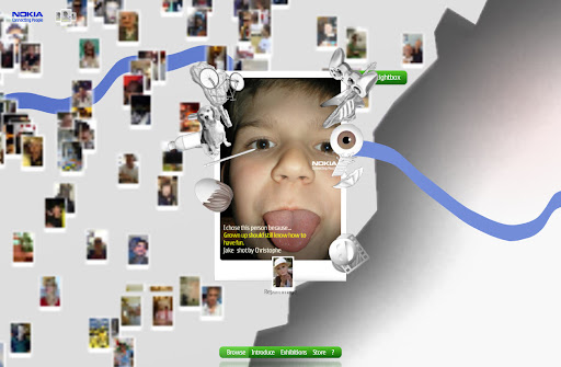 The fact that you are creating an advert for Nokia is great, not only the consumers will connect with the off-line posters but the chance of your photos making it in the real world is appealing. The site let you do your upload without asking for registration beforehand, this always help people to try promotion and should be encouraged more. I don't think the tags work as they can hide some part of the photo and are limited. The site could encourage more the use of the lightbox too but overall it's on brand and even if it's only for London, flagship store obliged, it does 'connect people'.
http://www.meet-your-city.com/
p.s: don't forget to meet Hong Kong too by spinning the globe.
Friday links
Posted in links
http://www.problemplayground.com/ Honda ads are always great, this site follow this and use some idea found on Lynx site or the DS, blow in your microphone for example...
http://www.challengechurchill.com/ Ok if people press yes all the time perhaps they will say yes to your quote, who know? but the Sudoku challenge and the DS competition seems to me that the brief was to get registration what ever the means. Shame it started well...
http://www.peugeot.fr/Produits/807/Monospace Not really va va voom but it's made to be editable by all of Peugeot countries using a Peugeot CMS back end...in other world a nightmare to do...well done to everyone involved...
http://www.adidas.com/campaigns/adidassler/content/index.asp?strCountry_adidascom=com Just watch the film...the web site in itself is minimal but it's nice to see that tradional animation techniques are still used in this digital world.
http://www.yogitea.com Good design and simple execution...
http://www.simplifyyourwork2008.com/ Office on a Mac...simple as it should be and this mean not like a Microsoft PC site...
http://www.myblackvalentine.com/ A really really old one but seems to still be relevant this week...
http://www.foryoumylove.co.uk/ If you done this you probably are single now..
http://www.google.com/doodle4google/ Like McDonald google recruit them young...
http://www.skinslife.com/ Skins on Channel 4 goes out in the street, will the real parties really be full of sexy teenager high on drug and half naked? live Skins...
http://www.spinebreakers.co.uk/Creative/Features/Pages/SarasFace.aspx Web episodes to promote Melvin Burgess book, to be honest I love the design of the site more...
http://www.rockstargames.com/IV/ A web site that is build like the game, you can be sure that more and more content will show up in the coming month...
8 Feb 2008
Friday links
Posted in links
http://www.joinourteam.com/ 2008 refresh of the site, even better than last year…well done to all involved in making this one as easy as possible…come on Join our team for the 2008 Norwich Union© ®™ Community Sports Fund© ®™ in association with the Norwich Union© ®™ Great Britain and Northen Ireland team© ®™
http://yourclientfromhell.com/ What can I say…take the test..and of course you will need the book…but hey made me feel better…
http://www.killwithme.com/ A simple viral game that could have been so much more fun if they have tried to be more clever as the subject matter is the net itself….if you are bored here are the answers Username:Owen Password: 012508
http://www.knickerpicker.com/ Valentine is coming and this site uses video to show you how your girlfriend will look like on that special night...
http://www.tigerwishingtree.co.uk/ Simple and nice but I already forgotten the brand…
http://www.theharrysituation.com/blog/ This could have been so good but perhaps it’s too content heavy for the yanks, or perhaps it’s not just that funny…follow up was this http://www.youtube.com/watch?v=3MqbaGofVW8 looks like this viral flopped…
http://www.myspace.com/superbowlads A mix of bad and good as always…
http://www.waltswisdom.com/ Classic viral from Breaking Bad…”there is nothing more dangerous than life itself”...
http://www.thecampaignforrealfloristry.com/ Will you pass it on? probably not...
http://www.mcdonalds.fr/#/gacc/ They have a video competition going on with a ski theme and the design could be good for Coke UK but where is the accessibility version?
http://mytalkingstain.com/ Put yourself in the commercial, more and more site let you record your voice too.
http://www.nivea.co.uk/beauty_is/ Nivea has updated his site for the follow up to ‘campaign for real beauty’ sadly I think their video is using to many good looking people but as they let real people upload their picture in the gallery. Expect cute pet and babies of course…the international gallery could do with a sort by countries...
http://www.youdontmesswiththezohan.com/ Shit site for shit movie but it's in for the online comic http://www.sonypictures.com/movies/youdontmesswiththezohan/sweepstakes/index.php
http://advancewars.com/ A really great flash site for one of the best game available on your DS. Minimal content but well presented. Let’s give everyone at BD a DS…
http://valentines.the-raft.com/ EMI promotion, everyone is a winner...of samples...
http://iminlikewithyou.com/ Are people comments annoying or are they adding another dimension? you decide…but this look so good it hurt…and of course the Arcade section is a great way to get people to stick on the site…
http://www.wehavetogoback.com/ In case you still care…
1 Feb 2008
Friday links
Posted in links
http://www.lynxeffect.com/ lots and lots of great stuff for marketing ideas from mobile gadget to twist on Facebook app to simple printable fun...Get in there!
http://colorholic.d-o-e-s.com/ So what's your color? Sharp design and video bring this site, that has minimum content, to life...
http://pepsistuff.pepsiusa.com/ Coke zone rival of course...
http://www.fifastreet3.com/ Cool site that display the move of the game in a classy way, the viral is even better http://www.youtube.com/watch?v=z-iCUm24bM0
http://www.knittedbynanas.com/ They could have gone so much wild with this, downloadable paterns for a start, instead 4 games...but 'The Chronicles of Nanas' are worth watching...
http://www.escriba.es/ As delicious as the products they make...
http://www.ideablob.com/ The best idea get $10,000 or the person with the most friend...
http://movies.break.com/rambo/ Really old school design, navigation and animation like the film and Stallone... This would have been good 5 years ago...
http://vic.henley.com.au/ Choose your house, slick and simple design, I just ordered one...
http://www.adidas.com/campaigns/verticalsfootball08/content/index.asp?adidas_cc=uk Adidas new football site is lovely crafted but they could not change the wooden voice over...
http://www.minikostkiknorr.pl/ Sorry I am not polish but click on menu and make sure you go left and right as you might miss some of the site..
http://www.harmonic313.com/wordproblems/ small budget, small idea, small viral site...
http://pac-txt.com/ Not commercial in anyway...retro here we go...but there could be something in it...


