30 Sept 2008

imapc.lifewithoutwalls.com/


Microsoft is trying hard to reverse the stereotype that PC users are geeks or office workers. Sadly the user generated content actually reinforce this idea. On a plus note the Time Square installation is impressive and will probably push people to upload their beautifully face to the site just to be on it but Microsoft adds are still funny in a bad way. http://imapc.lifewithoutwalls.com/
29 Sept 2008

survivetheoutbreak.com


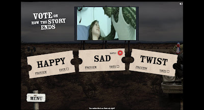
Remember the fantasy books where you choose your own adventure? Remember the interactive laser disk, well here is the web version. Is it worth it? after all the interaction is at a minimum and if you haven't got a good connection you will spend your time waiting for the video to load. I died twice and gave up, perhaps I should have persevered but the subject matter (zombies) is so cliché that I could not be bothered. http://www.survivetheoutbreak.com/
26 Sept 2008

getoutthere.qld.gov.au/


A government site all in flash? ok it's for teens so it won't confused the general public and it's really a big portal but well done to them for having the balls to do it. http://getoutthere.qld.gov.au/

xbox.com/en-GB


The Xbox site, looks like they looked at Nintendo and Sony and are going for a more conventional family oriented approach. They probably will loose the hard-core gamer but has the market is shifting this make good business sense. It's nice, it's sweet and that's a worry if you are an hardcore gamer. http://www.xbox.com/en-GB
24 Sept 2008

generationgreen.co.uk


Who is this site for? For kids, it's too content heavy and the game is basic; for family, it's not involving enough and it's an obvious data collection exercise from British Gas; for school? it's perfect but considering that it's not part of the curriculum will teachers really have the time to teach our kids how to go green? Schools get most out of vouchers scheme that kids bring in. Nevertheless it's a good initiative, the site is well designed it's just that online is perhaps not the best way for this campaign. http://www.generationgreen.co.uk

reebokboxing.com


This could have been a great site 5 years ago but sadly in today market there is not enough to impress you. For sure there is video integration but you would expect a little bit more interaction with Amir, a game where you try to replicate his moves in front of your webcam would have been fun. Instead we are left with a site that is not full screen and display the products and media in small window. http://www.reebokboxing.co
23 Sept 2008

whitebandaction.org


The new phase of the End Poverty campaign. The site aims to get you to sign up and do 5 things to help the campaign. The clear design and short text is perfect to engage people that are use to not pass the home page of most site even if this lead to some design issues as in the 'Who we are' section for example. I would I have liked to see more media content available especially some podcasts and I would have also have shorten version of the video as at nearly 8 minutes it will be a switch off factor for the youTube generation. http://www.whitebandaction.org/

Update: The in my name Youtube channel has been launched http://uk.youtube.com/inmyname
22 Sept 2008

paramountpictures.co.uk/howtolosefriends/


The desk design is not new but this is a good one. It's shame that not everything is active just yet. The paper notes are annoying as you navigate and a few more interaction would have really make this site alive nevertheless some good behind the scene footage's will keep you entertain for the time being but why people would want to use the widget is still a mystery to me. http://www.paramountpictures.co.uk/howtolosefriends/
19 Sept 2008

agentprovocateur.com/experience.html


Agent Provocateur has always played with the web and this recent output is even more polished. Granted it's a simple YES or NO experience but the full screen and B movie looks works a treat. http://www.agentprovocateur.com/experience.html
18 Sept 2008

loisjeans


I would have been blown away by this site if it wasn't such a rip of Uniqlo. It's still slick even if I hate this trend of displaying large picture that you have to scroll. The rest of the site is too simple and a proper store locator should have been implemented if not an e-com solution. As for a PDF download, it's probably for buyers only. http://www.loisjeans.com/web0809/
17 Sept 2008

fgp-toyota.pod2.jp


Fantastic use of stop-motion for this site. You will love it or found it the most stupid thing on earth as the interaction is minimum and not that engaging. Personally I enjoyed the ride and switched off but it is interesting to see old school technique used on the web. http://fgp-toyota.pod2.jp/
16 Sept 2008

wildridexm.com


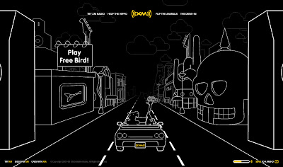
Great animations, fun to play with and some cool mini clips what more could you ask?
This is the perfect example of a site build to create awareness for a product that is hard to plug (I mean why would you subscribe when you can have it all for free?) It would have been good if you could at least choose the station you want to listen when driving the car, even better if the landscape could change depending on the station. Also the pop-up is a no no too... http://www.wildridexm.com/
15 Sept 2008

porsche.com/all/usa/ican/


Can you own a Porshe? The cars look like some kids toys, the videos are tiny and the 'upload your driveway photo' function make the car look like an episode of South Park. I mean who has a picture of it's drive at hand? and all the other links send you to the normal site, I was expecting so much from a company that has money and put style at the front of their marketing. http://www.porsche.com/all/usa/ican/
12 Sept 2008

microsites.audi.com/vdt-onlinespecial/


For such a great idea the content is disappointing, boring videos and badly designed interface which is a shame as the molecular effect is impressive and well implemented.
http://microsites.audi.com/vdt-onlinespecial/html/popup.html

loseyourexcuse.gov


Cool site for kids with a lot of things for them to do an explore even if I am not sure the impact the campaign will real have. A fun idea would have been to let the kids email their parents about it in a funny way or get them more involve with a competition Blue Peter style. http://www.loseyourexcuse.gov/

funonthefloor.com


Sadly the URL doesn't live to the expectation but as much as the content is boring the site is actually useful is you are in that kind of things. Good store locator, calculator and lookbook. The design is pure DIY mag and fit perfectly and they have throw in the B celebrity for good measure. http://www.funonthefloor.com

provokator.ru/play/


It started so well, Papervision navigation and cool design but the games that are supposed to be the center piece of the site are lame and poorly executed. The fact that you can get a discount is a nice incentive for people to play but they could just give vouchers away instead. What's more disappointing is there is no integration with the store itself, just an external link. http://www.provokator.ru/play/
11 Sept 2008

footlocker.eu/evolve/#/en/


Embracing the 3D trend and not just for the sake of it, the site deliver a really interesting experience that is integrated with the TV commercial. At the core there isn't anything new but the execution make it stand above the rest and the wallpaper creator is actually fun. All sections are worth trying. http://www.footlocker.eu/evolve/#/en/
10 Sept 2008

Large Hadron Rap


I had to post this today of course even if this has already gone viral and it's good to see that they are trying to reach to the masses in a fun and intelligent way.

vitaminwater.com


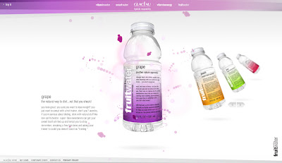
Knowing nothing about the products I was a bit confused with the different brands presented to me but the look and feel made up more than enough for it as I was happy browsing this well designed site boosting an impressive selection of stars. Sadly not living in the US, I could not try the trashtalk section but this looks like an interesting integration with the product. They also have a shit campaign to win a BBQ with Papi, the mini game is actually fun as they are trying to be a bit like the Wii by using your mouse movement to bat the ball, feel like rounders to me... http://www.vitaminwater.com/
!new: for the Trashtalk just enter "tryit" for your code...enjoy!

music.vodafone.com


A new interactive way to play with the navigation, throw the shapes around, expand them and trace your journey. All this would have been fantastic if they had put more effort on the content as sadly it's mostly text and outside links. It's the shame as some videos are interesting but the display is so small that you feel cheated and why can I download them to my phone? http://music.vodafone.com/
9 Sept 2008

remington-products.com/shinetherapy/


This is the type of classic product site you would expect for a boring product. The use of a full Flash site is not necessary and having sliders for text should be best avoided as a general rule. The video is only an advert and therefore disappoint. What save it? The Remington Hunk, not because it's rule breaking or slick but because it's a man and not the half dress bimbo. http://www.remington-products.com/shinetherapy/universal/

talktothetown.co.uk


Simple concept and simple execution and this is not a bad thing as the embedded results works really well. Of course I could argue that offering .pdf is not the things to do and that all the info should be on the site but considering their audience (brand people) they might just need them. http://www.talktothetown.co.uk
5 Sept 2008

turbogene/GLOBAL/en/index.shtml


So well executed that you probably won't noticed that you are in fact just playing with pre-generated content that lead you to one of the 5 cars Saab is trying to sell you. The problem is that I would like the possibility to learn more about the car inside this beautiful site but no, there isn't anything that let me know the specs, I have to book a test drive or go to the Sabb website, it's shame as even a .pdf downloadable brochure would have at least satisfied me. http://origin-dyc.saab-web.com/microsites/turbogene/GLOBAL/en/index.shtml

canon


The new Photo5 competition is ready to go and what I love about this one is not is online element but the off-line one as Canon is actually sending a mysterious box to all participants and this only raise the fun and excitement of the competition and push creativity. The web here is used as a tool for registration, display and voting and that's all it's needed, perfect. A campaign that think outside the screenhttp://www.canon.com.au/photo5/

skypelaughterchain


Laugh is contagious and to encourage people to use Skype in video mode this campaign managed to found a small mechanic that works worldwide and bring a little happiness to the world. I must be a miserable bastard because I only managed to raise a smile but I still love the principle. Of course the first clips you see are not from Skype users but they had to start somewhere. http://www.skypelaughterchain.com/
4 Sept 2008

pimpmykettle.ning.com


You have to try Pimp my virtual kettle, simple but fun. It's all in the name of charity too but with some cool videos and a loose storyline this is a refreshing site that support the off-line activities really well but I am not sure there was a need to try and build a community around it. Of course registration prevent pranksters to a certain level but it also reduce interaction. http://pimpmykettle.ning.com/

nationalbakingweek.co.uk


It looks like that as long you have the cash anyone can do a 'national day' or 'national week' about something. Is there a corporation somewhere that is actually in charge of looking after all the weeks'campaigns? just to make sure they don't clash? like making sure this campaign doesn't clash with the Holocaust remembrance week for example (bad joke - sorry). Anyway the site features the usual family oriented content and managed to plug all the sponsors product nicely without forgetting the usual celebrity thrown in for good measure. The blog is a nice idea but I would have liked to see more user generated content, an use of videos or simply the possibility to print the recipes. http://www.nationalbakingweek.com
3 Sept 2008

runcactuskidrun.com


Vote for the final ads, a good way for Oasis to air the right spot and too make sure the viral effect is checked there is a lot of youtube clips and related sites like http://www.findcactuskid.com/ where you can search the kids on a Google map, http://www.mothersagainstcactuskid.com/ or http://www.myspace.com/cactusgirl87. Personally I would have combined the lot in the main site as I don't believe Cactus Kid has the appeal to become the new Flat Eric but it's a nice campaign http://www.runcactuskidrun.com/
2 Sept 2008

bioshockgame.com/ps3/


Bioshock is one of the most atmospheric and story driven first person shooter and the site does display both in a high quality 'experience' but the problem is that you feel more on an haunted mansion ride than actually immerse in the environment. I would I like to see new items when I went around for the second time for example. Don't forget to clicks on the other sections too even if it's just to see a nice 3D sequence.
http://www.bioshockgame.com/ps3/
1 Sept 2008

boiretrop.fr


Campaign against binge drinking in France. Good use of Flash 3D and interaction as the sections only load if you shake the mixer but they could have push it more through out the site like in the posters section. The viral has pretty good tune and you actually want to be able to download it from the site and this make the argument less powerful. Waiter! more 3D in the mix next time. http://www.boiretrop.fr/
Related Posts Plugin for WordPress, Blogger...
 

Copyright © 2011 It's only Digital. All Rights reserved
RSS Feed. This blog is proudly powered by Blogger. Design by dzignine based on Minima-White code frameworks