29 Aug 2008

kelloggs.co.uk/whatson/wakeup/


National Breakfast Week, what the fuck? Ok let's forget the concept, they paid Kelly Holmes to try to put credibility to it. Really this is trying to jump on the Nintendo bandwagon by proposing a series of simple mental challenges and adding the usual family and kids contents to make up the rest of the site. Nothing original here and they should be ashamed of the 'Activity Finder' as it's only embedding a page that doesn't even fit on the site. The only original thing here is the use of Live Search for clues but why would you want people to live your site is another thing? http://www.kelloggs.co.uk/whatson/wakeup/

truthaboutsmart.co.uk


Flawless video integration even if the interaction is limited to "continue". The ghost cursors is a good idea taken from the video games environment, sadly it's seem fake as it would have been fun to know your mouse movements are being recorded and will be used for the next visitor. It's only an extended add really but I like it. http://www.truthaboutsmart.co.uk/

pumarunning


He hasn't taken long for the Olympic heroes to be used online and Puma classic button bashing game is worth a look just because the video interaction is well executed. http://www.pumarunning.com/#EN/running/content/side/youVsBOLT
28 Aug 2008

vikingline.se/dancematch/


Mastercard did this something similar in February for the Brit Awards and when I visited the site only 11 entries where available, my guess is that at least half of them are people from the agency that create the site too. I don't speak Swedish but the point is that your dance style should help you found a match to take on a cruise with free tickets. So instead of trying to arrange a blind date just upload 2 videos, one of your girlfriend and one of yourself with the same rating and hey presto you will be matched and bag the free tickets...http://www.vikingline.se/dancematch/
27 Aug 2008

warte-bis-september.de/


Can't believe I missed this one, so go and look at it now. Live streaming from an empty room with a bloke that is waiting for the new IKEA catalog to come out. You can email him and phone him too, simple, well executed and with the Big Brother effect still strong, this is a winner but I wish he had some tasks to do. http://www.warte-bis-september.de/

superhero-me.co.uk


The NHS has not money so this is perhaps the reason behind this horrible viral but I will not shoot them down as at least they are trying to gain awareness to a good cause. I have registered as a donor as I lost my donor card a few years back but I am not sure if someone that never though of it will respond to this at all. http://www.superhero-me.co.uk/
26 Aug 2008

willharrydatesally.com


It's the web so why should I text? I understand if they show the clip in cinema but please not on the web...of course they will get phone numbers but the drop rate will be massive. Also there should be some Facebook page for the protagonists and I hope they partners with some other sites too as the market for online soaps is starting to get saturated. http://www.willharrydatesally.com/
25 Aug 2008

nokiaconnectors


A simple campaign that works well as it's based on a simple trick. it starts with this:


and then you are redirected here: http://nokiaconnectors.com/dynamo/.

I like the fact that they took the time to create an application for the phone so you can be a magician yourself too. After that all the rest is branded content but there is some cool external links for the kids, like "The Inaudible Ringtone" that can not be heard by the over 30.
22 Aug 2008

girleffect.org


Simple Paper vision effects but the power of this campaign it's and old school animation, nothing more, nothing less and a soundtrack that match the style. The rest of the site is simple to let the content speak for itself but doesn't push enough to donate and it should as it's a rewarding campaign. http://www.girleffect.org
21 Aug 2008

digitalnomads.com


Of course it's a big plug for Dell's computers but you have to admire them for going with blogs and some interesting writers. It's only the start and creating a community is always an hard task but Dell seems to be open to share. So we will have to wait a bit to see if this become a cool place simply a deserted marketing campaign. Of course it would be nice if they can get read of the login bug. http://www.digitalnomads.com/

levi.com/estelle/jamie/.....


Part of the 'Unbuttoned' series, what is not to like? Well, that sadly I want more content, the full screen video is great and of course having cool name will help sell your products as with the exclusive track/video. What a shame, as the director managed to get a natural unscripted look for the introduction, a natural progression would have to be a more in depth interview or to see a video of them in real life wearing the jeans. And you get nothing for watching all the 'unbuttoned' artist. http://www.levi.com/jamie/
20 Aug 2008

deepzoomobama.com


It's a classic zoom function but it works well by using Silverlight technology, this is not an official site but the fact that someone took the time to develop this deserve a mention. Use Explorer to see it http://www.deepzoomobama.com/
19 Aug 2008

babylonadmovie


A new film from Vin Diesel with a bit of Mad Max in it, create your fighter and challenge people. The customization is minimal but it's interesting to see more and more viral/games trying to emulate what Xbox live is doing, lobby room where you can chat and leaderboard are present. Sadly once you have created your fighter you can not edit it and there is a few navigation issues like the fact you need to log-out to see the instructions but once you manage to found someone to fight, the full screen experience is impressive. The animations are fluids and the fighting fun for 5 minutes but not more to be honest as it's still a web game after all. http://www.babylonadmovie.com/game/
18 Aug 2008

fifa08.arena.n-gage.com/


Poor Nokia and their N-Gage platform, they are trying hard and they know the best way forward is to give away stuff free for people to realized they actually have the application on their phone. So enter some viral and a free copy of Fifa 08, the scripts show the user are geeks so I am not sure how this should inspire people to give it a go. It's a shame that you are redirect to another site for downloads as these should be integrated in the site but the budget must have been small. http://fifa08.arena.n-gage.com/

cityandcolour.ca/sleepingsickness/sleep.html


Of course it's not fully interactive but it's still a step forward into experiencing a music video. Make sure you try it in full screen http://cityandcolour.ca/sleepingsickness/sleep.html
15 Aug 2008

clonesvdroids.com


This is a massive reap off of Worms but hey who care, it's Star Wars and you can play against live opponent. Of course the site could do with showing a bigger trailer or having some cute animations taken from the official site and push some downloads but they know they don't need to do this, it's a shame but it works for them. I would have love to have the option to play against my friends, invite them for battle or just see the ranking and register for it. http://www.clonesvdroids.com/

dont-miss-out.co.uk


During the festival season everyone wants to jump on the bang wagon and Pro Plus might have a case as the kids do not want to miss one minute of fun (personally I think the kids might use something else than Pro Plus but that's a different story). The site is really basic and concentrate around one music game. The video change depending on your score, I found it a bit long but it is in line with the campaign and does the job well, it's just not that original but the music save it a bit. A simple campaign that I am sure will make the client happy but will be forgotten once the festival is over. http://www.dont-miss-out.co.uk
14 Aug 2008

facespook.co.uk


I never saw Spook so I was interested in the URL, thinking it would be a take on Facebook. It's none of it and considering how much the BBC have played recently with video and interaction it's disappointing to see the site constrained to such a small window and only use simple choice interaction. The Oddcast technology is still good but perhaps we should try now to use it in a more creative way. The classic viral options are offered and the Facebook integration works well but a mobile download could have been viable too. http://www.facespook.co.uk
13 Aug 2008

thejinglegenerator.com


I know nothing about QuickBooks but their viral is fun, cheesy in a good way and not to over the top to be bad. They have managed to get the options right as you can call-in to personalized your jingle and more importantly you can share it easily and download it too (fun Easter egg in the zip), they could have included the option to send to mobile to try to collect phone numbers. My only complain is that if, like me, you have a few toolbar as part of your browser set-up you have to scroll down at the start but I am being picky here. I expect the target audience will know Quickbooks and therefore act on this because I didn't but brand awareness is always good. So try the VVB Jingle
12 Aug 2008

gummy-bear.com


It's the fucking Crazy frog all over again...run people run....so expect 'Send to a friend' mechanic for sure but they could have done so much more to be annoying, more downloads, more sharing option, where is the Gummy's blog? the Gummy's Facebook page? the Gummy' shop? The Gummy's viral? The Gummy's Twitter? if you are going to be annoying and everywhere make sure you are everywhere...http://www.gummy-bear.com/
11 Aug 2008

crumpler.com.au


This site could have gone wrong as using a funky interface and flash for an E-commerce solution is always risky but they managed to pull it off. The site is practical and the navigation well integrated. The site demonstrate the fun aspect of the brand without trying to be funny (make sure you look around) and most of all it has an integrated checkout system. Perfect https://www.crumpler.com.au
8 Aug 2008

catchlewis.com


Do you really think Lewis drinks Nestcafé before a race?
You have to register to race, bad practice, but the website tries to be a bit more clever as the clues are hidden around the net and there are some simple interaction: with Google map for example. There is something in there, the next challenges will be interesting to watch but at the moment they haven't hit the spot just yet. http://www.catchlewis.com/

familyoftheyear.co.uk


Partnering with a great charity doesn't make you immune to criticism. What have we got here? A toilet paper that is looking for the Charmin Family of the Year, please... at my house we spend our family time in the toilet, comparing poo and counting how many sheet of paper we use, it's fun and educative, so surely we should win?
Using the web only for an entry form is poor, show us at least the families that have entered and more importantly make me understand the relevance to your product please, you might look after my kids arses but no my life, that's patronizing. http://www.familyoftheyear.co.uk/

fourridgesmustbedestroyed.com


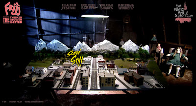
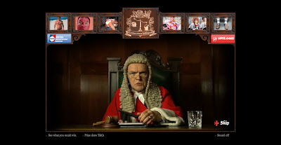
A simple site that takes on parody of the 50's B movies for virals, especially 'The Blob'. This is a strange proposition as the list of film in the Friji festival doesn't include any 50's B movies but no one will argue as you can to see classics for free. This is glue together with a traditional youtube competition (it's cheap to run)and an on pack competition. Basic but fun campaign, that relied too much on the fact that the product is well love by the audience instead of trying to expend it. http://www.fourridgesmustbedestroyed.com/
7 Aug 2008

evolutionofsmooth.com


A simple teaser site for a new product. The site content is minimal, the press section frustrating as it's only an email link, the link to buy online is not clear and perhaps some user comments would have been good but you can not fault the simplicity of it and the full screen video that demonstrate the product. I am sure some geeks would love to have this as a screensaver. http://www.evolutionofsmooth.com/

Follow your instinct on YouTube


Interactive campaign on YouTube...interesting...no need for a mini site, no need for hosting, no need for design, no need for quality editing or resolution, fantastic news for big budget...sadly it seems that this campaign as also decided to have no need for a real story, no need to tap on to the female audience (unless there is a girl version?), no need for originality (thank you 'Smack my bitch up'), no need to actually understand their target audience and no need to display the real USP of the product. But it's a bold move, they just could have done so much with it. Personally I can't wait for the Fighting Fantasy series to be made in this format...
6 Aug 2008

cokezone.co.uk/loyalty/loyalty.jsp?promo=olympics&detectFlash=true


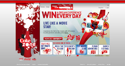
The first bottle promotion that Coke is running inside the Coke Zone site. The reason for this is because no one care about Coke Zone or the prizes, even if to be fair that have now some that are actually interesting, the problem is that you mostly always enter draws or that some of the offers are available free somewhere else on the net.

I suspect the design has been influence by Coke needs to let people know that their hard-to-read codes are actually hidden behind the packaging because there is a massive 'how do I enter' button (that you are only going to use once) and a small button to actually enter the draw.

You are suppose to 'Win a dream experience everyday' great! but is this just running for 6 days? nothing on the page talks about dates, so you don't know where you are withing this promotion. Select any of the prizes and the 'Today's draw' line doesn't change, so are they doing a draw for each prize everyday? only if you read the T&C will you found out.

This is actually an 2008 Olympic promotion (even if they have the 2012 logo too), so can someone explain to me what a VIP access to Simon Pegg's film 'How to lose friend and alienate people' got to do with Beijing? Now, if this is a hidden political stand from Coke on the China government than I applaud them but for some reason I doubt it.

What a shamble because who ever sort out the prize seems to have done a great job, it's just a shame that Coke didn't have the balls to do something more cutting edge than some prize draws, it's waste of their sponsorships and a waste or their marketing money.

Agencies are supposed to push client, in this case it's seems they only wanted to please Coke and the consumer experience is suffering. http://www.cokezone.co.uk/loyalty/loyalty.jsp?promo=olympics&detectFlash=true
5 Aug 2008

holidaycrimes.co.uk/


The classic choose some drop-down options, upload a photo and send to your friend that technically supposed to found the clip funny as there is no chance you could fool them for the real thing. Asking your personal details before you can even preview the clip is a bad move. Using a junior to do your design is another bad move. Come on people surely you can be more creative. http://holidaycrimes.co.uk/
4 Aug 2008

seethewholestory.com


Here we have the usual give a base to some artists and see what they come up with. Obviously the strength of the website is as good as the strength of it's content, so I hope Samsung is happy because personally I only viewed the films in their entirely to review the site. The camera might be a good piece of kit but the site isn't, even with the constrain of width, more could have been done with the design, the penguin and the beauty queen. And they should give one away at least. http://www.seethewholestory.com/

oldspice.com/tvmd/


It's certainly hard to sale antiperspirant product on the web but this is certainly not the way to do it. It's no funny and the execution is poor. I know it's supposed to be a parody but it's to bad to be good. The product is not even integrated in an intelligently in the script and only getting the possibility of printing your badge at the end is not enough of a reward for the 5 minutes I have spend on the site. A smellcam application would have been better. http://www.oldspice.com/tvmd/
2 Aug 2008

sexyis.keeplifesexy.com/sexyis/


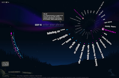
Another version of the idea of user generated content to define a world, this time it's SEXY. A nice interface and a simpler mechanic to stop people entering to many rude things. It's a shame that you not upload your photo on the site itself and need to use their Flickr group instead, and this would explain the lack of entries from actual people. It's a sweet site more than a sexy one, you are done in 2 minutes (no punt) and as you can not share anything with your love one, pointless... http://sexyis.keeplifesexy.com/sexyis/
1 Aug 2008

twix.com


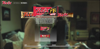
An interactive love story for boys, does this mean girls don't eat Twix? The video production is high but: are the user supposed to project itself on the central character? Do you really care if he gets the girl or not? Is this actually funny? are we just seeing a return of interactive stories that use to be on laserdiscs? and will you even return to the site? This format is great for video production houses for sure but it's certainly not pushing the web boundaries. http://www.twix.com/

flauntyourtaste.com


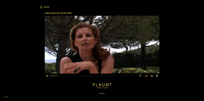
Bad taste...http://www.flauntyourtaste.com

talkingpets.org


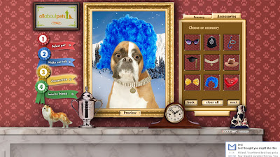
A great idea that could go so so wrong if you start uploading picture of people and witting unPC dialog, so I suppose it will become a hit one way or another even if the idea is no new or some functionality could have been improve (selecting the mouth area instead of putting a pre-rendered one, showing how many character are left, making sure accessories are available to uploaded photo), but make sure you check out www.oddcast.com too as their technology has improved a lot. http://www.talkingpets.org/
Related Posts Plugin for WordPress, Blogger...
 

Copyright © 2011 It's only Digital. All Rights reserved
RSS Feed. This blog is proudly powered by Blogger. Design by dzignine based on Minima-White code frameworks