30 Apr 2008

hazegame.uk.ubi.com/experience/


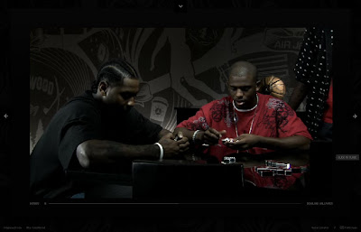
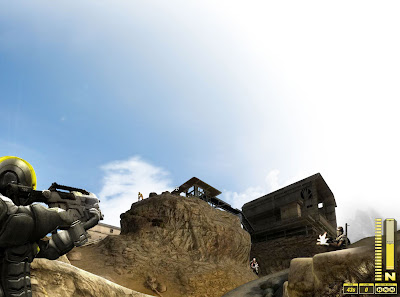
Ubisoft obviously saw that the Assassin's Creed experience site helped them shift copy of the game so they are at it again but this time it failed because it introduces mini games. You should never try to based mini games on your actual gameplay it will never work. The rest of the experience is worth a look but the damage is done. http://hazegame.uk.ubi.com/experience/

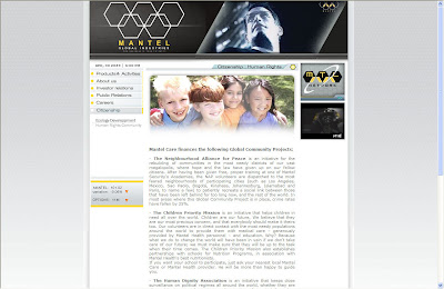
The 'de rigueur' fake corporate website is full of great content but if Mantel is technically this multi million dollars corporation; surely they would have a better site than some flat html pages. http://www.mantelglobalindustries.com/

Chanelle Hayes Sex Tape


Sex sells and to be honest fair play to them for using a well know and well parody clip to promote their show but what makes it viral? The parody? Channel's arse? or the pleasure in seeing a Z list celebrity going so low?

nike.com/nikeos/p/nikefootball/en__EMEA/


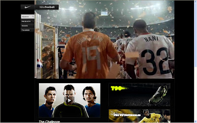
As a campaign it looks like the usual weekly training program idea but of course being from Nike it will be high quality with a great content and being able to track yourself against your mate is always good, add a some mobile content and it all make sense. My issue? the teaser for this is not really PC but hey I suppose you have to be real. http://www.nike.com/nikeos/p/nikefootball/en__EMEA/index.html
28 Apr 2008

experience159.com


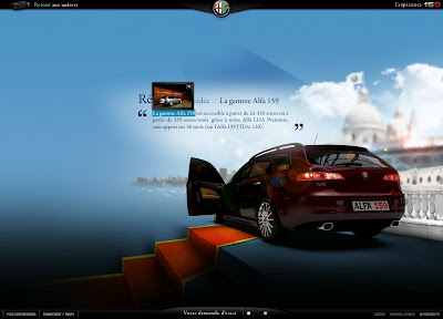
It starts with a 2001 Space Odyssey homage but this slick site make great use of full screen videos to showcase the cars. It's hard not to be impress with the choice of angles and animations. The use of words as navigation is actually intuitive; it's just a shame that the stylised screenshots section doesn't fit with the site. http://www.experience159.com/

myskip.com


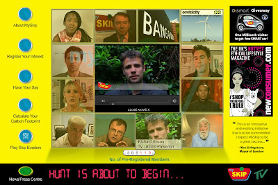
A new initiative for recycling with a lot of celebs behind. It looks like they done their PR right but forgot the design, the information architecture and are pushing the mobile options too much. People will not use the site on their mobile and they forgot to look at Ebay, I am not saying they should have copied it but so many things could have been borrow to make this a proper free contender. My guess is that this site could end up in the skip sooner than they realised. http://www.myskip.com/
As an alternative http://www.freecycle.org/ is pretty good, simple and work well already.
ipower.movielol.org


Can't these people make it in the papers? they have done so last year with the Blow Jobs campaign. Now they are it again with the 'Don't stay a Virgin' and the 'Stop Virgin' campaigns. They got the right ingredients: a pretty girl and some technological / social issues. They are massive on the Net http://ipower.movielol.org/
25 Apr 2008

arenamagazine.co.uk


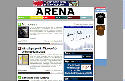
Arena mag as relaunch his blog / website...gone are the ladies in the background and welcome ads, podcast and a new look. As a cheap way to give your reader extra content and a place to comments this is spot on. RSS feed, tags and 'Add it' de rigeur of course. http://www.arenamagazine.co.uk/

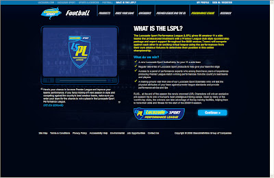
lucozade.com/sport/sports-and-exercise/football/performance-league/default.aspx


Grassroots Football seems to be the only way these days so here is another campaign. A Partnership with clubwebsite.co.uk is a great idea but the web site sadly looks so amateurish that it is damaging the promotion. http://www.lucozade.com/sport/sports-and-exercise/football/performance-league/default.aspx

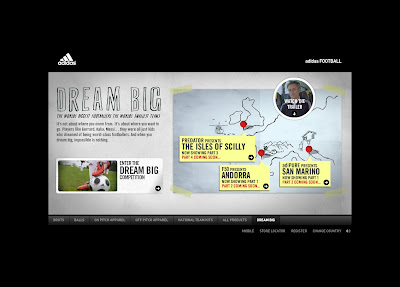
adidas.com/football/


A great campaign and some great reportage but what will the consumer get? A competition for a brand new kit. Sure it's a great prize but surely the chance to have Morino coaching you would have been better. Self indulgence to be honest. As for the site, the videos should have been bigger and the navigation improved. http://www.adidas.com/football/

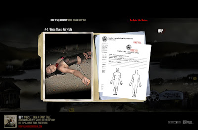
worsethanafairytale.com


12 songs, 12 murders and a web site that remind me of a Twin Peaks meets Blair Witch. I would have added the lyrics as part of the police files and a longer sample of the song. As it's obvious the site is here to sell the record, a promotional video would not have been out of place too and you could even push some downloadable content based on the photos and designs. http://www.worsethanafairytale.com/
24 Apr 2008

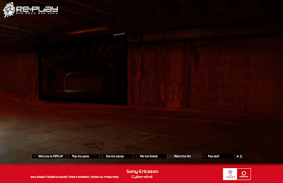
replaywall.com


Great movie but I think the moves are too easy and I am pretty sure the kids play this game already, they don't need a big organisation to tell them what to do. Now if they were doing an offline tour then I would have understood but they don't; so it's pointless. Especially as you can not upload your replay moves. http://www.replaywall.com/

welcomebackspring.com


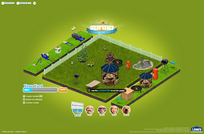
The design take on their commercial theme and use videos to present the products . The yard creation is fun if you want to take the time to do it. The tips and advices are just right to entertain and they managed to mix the products nicely in the scripts without being pushy. The wish list is a great tool, it is just a shame that it is not linked to the commercial site. http://www.welcomebackspring.com/

get-out-and-play.com


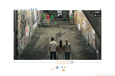
Using stop motion in this time of CGI is a bold move and using it for a mini game is even better. Not only the idea from the film is based on what people do with their device or have done, the nostalgia effect works on a lot of level too. It seems normal to have a youtube viral and behind the scene video for PR and world of mouth but this is sometime sadly missed in most campaign. The original N-Gage was shit they must push harder the fact that it is now become a gaming application and not a device. http://www.get-out-and-play.com/

hrp.com


I don't usually review corporate site but the fact that these guys used your webcam to navigate their site is a brilliant move. http://www.hrp.com/

thirstfortruth.com.au


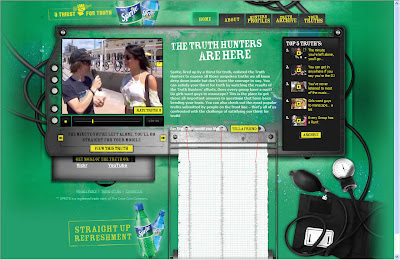
This work only because the people doing the videos are actually funnies for their target audience even if the usual Jackass theme is in there. The site itself is basic and there is no product info but they don't need it, it's all about the attitude. http://thirstfortruth.com.au/

threeandoutmovie.com/thedebate/


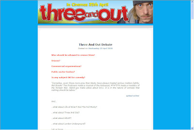
The website for the film http://www.threeandoutmovie.com/ is poor, they used to them like this 6 years ago but what's interesting is that surrounding the debate over the subject matter they have used the net to give the public opinion a voice. Granted it's a small offering and they could have done more to encourage people to post or support the film but it shows that from a reactive point of view the net is perfect http://www.threeandoutmovie.com/thedebate/
21 Apr 2008

aliciainafrica.com


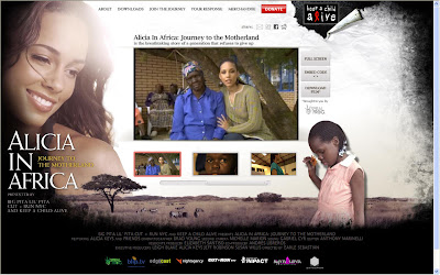
I am the first one to admire people that try to make a difference and we should differentiate the content from the form on this one. From a build point of view the site could have been build better as there is a design issue between pages, the accessibility version could have done with a bit more attention, a transcript or subtitle should have been made available and a synopsis of the chapter could have helped. I would also expect partnership with the like of Joost or Vuze to help reach more people. As for the content I will let you decide if this is self promotion or a selfless campaign. http://www.aliciainafrica.com/
18 Apr 2008

tania.movielol.org


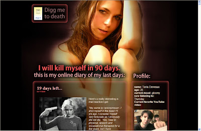
Interesting campaign, sadly the good looking design give it away...also the favorite video should not be the one about their other campaign. http://tania.movielol.org/

eccoworld.ecco.com.pl


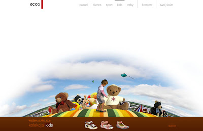
Showing a product in action is always best and this site does this in a simple but effective way. A few Easter eggs would have had some interaction and I would have I liked to stop the close up video frame by frame. Funky Widget too. http://eccoworld.ecco.com.pl/

luxuryawaits.com


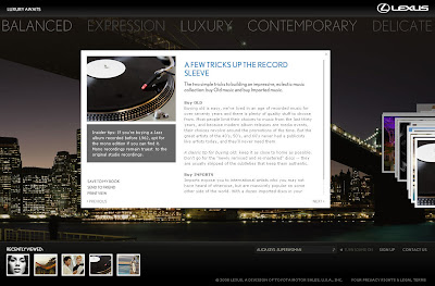
I don't get it, no car info and 17 basic articles that most of the time send you to another site? What's Alicia Keys got to do with it? or you do a site based around Alicia Keys or you do site that is updated regularly and actually has value for your audience. Combining the both in a good looking site doesn't had anything to the pointless content. http://luxuryawaits.com/
17 Apr 2008

sortoutstress.co.uk


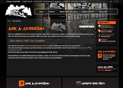
I admire organization that try to help people so well done for trying to use the net. Sadly a straight partnership with the Samaritans would have been better as "We will try and answer your question within one week." is not good enough for someone that need help there and then. http://www.sortoutstress.co.uk/

cars.com/waitingroom/


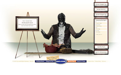
The humor is too simple for me I am afraid and what we got here is a simple "send to a friend" mechanic. It might be in a video format but the personalization is nil and therefore make the call to action pointless. Unless the plan B are a long term strategy they missed the point. http://cars.com/waitingroom/

tennentsmutual.com


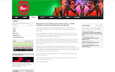
This is not about the creative or the usability (could be improved) but about the idea. If you are a big drinking corporation, music is part of the lifestyle of your consumers and, better than just sponsoring events for the hell of it, a bold move is to give your audience choice. Probable a bit inspired by http://www.myfootballclub.co.uk/ this is still a great move into communicating directly with your audience. http://www.tennentsmutual.com
15 Apr 2008

whitegoldiswhitegold.com


Spinal tap homage for the generation that are to young to know. Beautiful executed, it deliver the real message in clever way and simple interactions, you might not come back to the site but you will have spend enough time on it to remember. The downloads are the usual stuff but they are so well crafted or funny that they feel more than what they really are. Managing to have Dave Grohl as a friend on MySpace give credit to the campaign. Enjoy White Gold and the Calcium Sisters, beat the monkey from PGTips for sure! http://www.whitegoldiswhitegold.com/
tickets2moscow.com


There is no need to have done this in a magazine format has the spread doesn't follow any of the magazine convention. The adverts should have been full page and the quiz questions random, it's nicely designed but it has a poor promotion drive at his core. http://www.tickets2moscow.com/
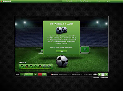
You might also want to try http://www.championsplanet.com for the UEFA cup tour.

Sony Foam City - Viral or just hype...


The new Sony video is on the net and it's beautiful even if I am a bit disappointed by it personally. The problem is that after watching the making off and behind the scene footage for the last few days I was really exited by it but seen it all pixelated on YouTube made me think that I am actually missing the most important part of the message: that Sony's TV have great picture. Perhaps they should have try to make it a TV event or have an URL at the end that will redirected people to a high quality version of it. http://www.youtube.com/watch?v=ZBXkrU86YxA
14 Apr 2008

hottubstopshunger.com


Using fake videos to get your message across is not new but these ones are more than just a 30 second viral. Sure you will not care about the products but will remember the catch phrase when you see it offline. The game is fun but a evoucher would have finish the promotion nicely. http://www.hottubstopshunger.com/
11 Apr 2008

drpepper.co.uk


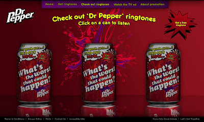
With a tag line like "what's the worst that could happen?" so much more could have been done...from pretending to play with the user setting to some joke virals for your friend. You can enter by mobile, make sense as this should be the first route of entry for this promotion. You get a shit ringtone, I don't think the consumers will care. http://www.drpepper.co.uk/

caribbeanchallenge.co.uk


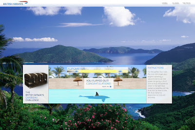
Quizzes and some not so good flash games, at least you are guaranty to win.The navigation is minimal but you should be able to access the games from the info page too. Lovely site for the more mature surfer. http://www.caribbeanchallenge.co.uk/
10 Apr 2008

magnifique-women.com


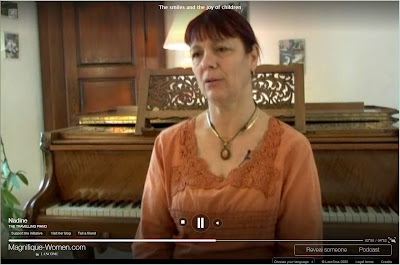
A simple design that should let the visitor be free to explore in all direction and not just in one axe. The idea to nominate someone is integral to this campaign but considering that Lancome have chosen the interview route it might be a while before they had any new content. The interviews are interesting and of high quality (especially in full screen) but it's a shame that some blogs are still empty. The visual representation of links is interesting and could be explore more than it has in the supporters sections as supporter should be connected to each other too in one way or another. http://www.magnifique-women.com/
9 Apr 2008

doritos.co.uk


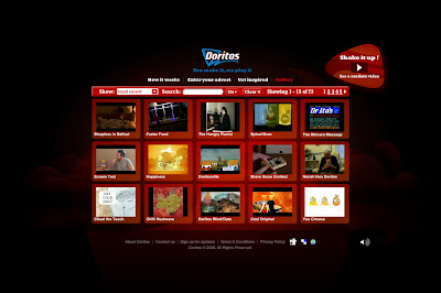
As much as Youtube or Myspace contests have been done to death, trying it on your own these days is always risky business. The competition prize is good and there is enough info to help the participants in doing Doritos PR for them. Overall Doritos is still a winner as the cost of a normal TV advert will probably more than cover the cost of the prizes and site build but will they have enough visitors and awareness? Hopefully this is promoted on packs http://www.doritos.co.uk/
zune-arts.net


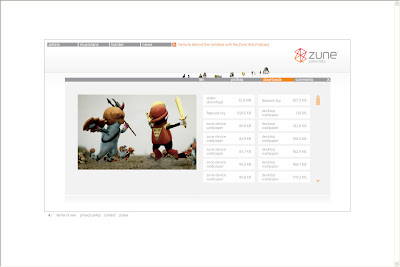
The site message is not clear, are these artists fonded by Microsoft? How do they get selected? Can you join in? I supposed the idea is that you like the content and the vibe you might want to download the Zune Marketplace software or even buy a Zune. I encourage the initiative but the consumer journey to purchase is not there at all and the lack of comments doesn't help building a community, at least I can build some nice flat pack toy. http://zune-arts.net/

magnummanor.com


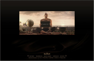
Is this for men or women? You got Eva but the rest of the cast if full of sexy guys... There is some nice minimal user interactions and the the tones is funny enough to get you going but they could have push more personalisation, the video message for example or created a Facebook widget out of the Maya magic ball. The product section is actually a let down compaired to the high quality value of the site and you will not come back to it as repeat visits do not make a difference to your experience. http://www.magnummanor.com/

ourfamilytime.co.uk


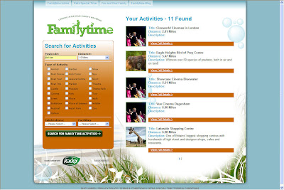
Radox wanted to create a site that is useful more than heavily branded but trying to enter the search arena was always going to be hard considering that other sites are doing this already from the simple to the more complex. My search was disappointing 3 cinemas, 1 shopping center (with an image of a giraffe?) and one bird reserve. As for the treats for the parents, you have to print and send a form and because they are using a an outside company for this you keep having the main site re-appearing in pop-ups. The family tree section is useless and the blog hasn't been updated for 10 days. Hardly engaging stuff, might as well done a products site instead would have been less of a disappointment. http://www.ourfamilytime.co.uk/
8 Apr 2008

nike.com/jumpman23/xx3/


A sombre design for what is simply lot of videos. The navigation is interesting but you could miss the fact that if you hold your left mouse button outside the video zone you can navigate this way too. With all this content it's a shame there is no way of sharing it or use the design for you own site. http://www.nike.com/jumpman23/xx3/

Green Clean - ecoverextreme.com


This is not a viral but a fun advert (the speech at the start and the OTT effect make this an ad), so it's not because you put it on your tube that people will make it a hit, it's worth remembering that sometime. http://www.youtube.com/watch?v=O3AG_B5NNtI

lucozade.com/sport/fitness/


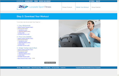
A good idea and a good partnership with Fitpro but can they compete with Wii sport ? Have you ever try to do a work-out by looking at an ipod 2m away from you? Sure you can download all the videos and play them on your home PC or laptop but it require planning so not likely to happen. I would have done this via interactive TV and created a freeview Channel for it. http://www.lucozade.com/sport/fitness/
4 Apr 2008

whoismgmt.com/efvideo


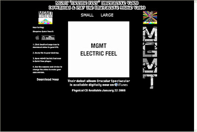
A good concept, but this could have been made with Flash and therefore online as I don't see who is going to download 200Mb+ plus file just to do this; considering the quality of the video I think they were on a tight budget. It would have been better to offer downloads to portables devices instead. http://www.whoismgmt.com/efvideo/

carling.com


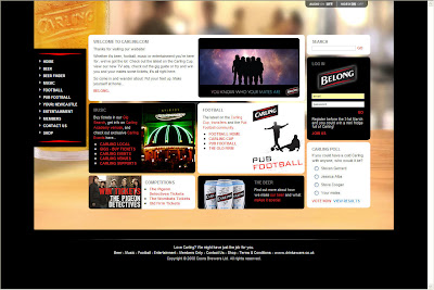
The new Carling is trying to be a portal but being a portal is not about just putting all your links on one page. The 'Beer' section is confusing as each section have separate styles. The Pub finder doesn't let you enter postcode and could do with better IA. I don't care about what happen in Newcastle as I don't live here so feel rejected. 'Pub Football' is still a great idea that combine online, offline and of course pub, if only it was made more user friendly. The music section is full of good promotions for any music fans but again too confusing and too many fields to fill...it's a mess, wish is a shame because they have the content to make this a destination site for all beer lover. http://www.carling.com/

doyouwanttoseeamillion.com


We should always remember that sometime bigger is not better and that the web is after all for everyone. This struggling artist is doing his best to get his message across with no budget and even if it's proposition is based offline I admire his boldness and his drive as he gave me his folded A4 advert this morning outside the tube station. After all the man behind http://www.milliondollarhomepage.com/ hasn't done bad for himself. http://www.doyouwanttoseeamillion.com/
3 Apr 2008

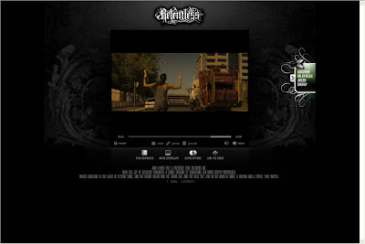
morningistheretobebroken.com


The URL is the only thing that you seen on all the billboards across town, so you would assume it's worth a visit. The video did not engage me as le parkour has been used before but have I seen it in full screen I would at least have been impressed. You can download to the film to your PSP and Ipod and some sharing options are available. http://www.morningistheretobebroken.com/

starbuckscoffeeathome.com


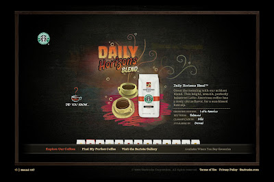
With the attraction of a complimentary sample pack Starbuck can not go wrong in building a database of potential customer but it's a shame I could not get my recommended flavor as the sample. The 'Did you know' doesn't need to request user interaction and the Barrista Gallery is empty, instead of asking the user to vote, asking them to create one would have been better. What's actually missing on the site is the usual Coffee music, instead we get an annoying chalk sound and a few sound bites. http://www.starbuckscoffeeathome.com/

Tipping Pot (Guinness Spoof)


A first for the site, I am posting my first link to a viral video, after all virals are a part of the marketing mix and this one is s'pot' on the UK target audience. http://www.youtube.com/watch?v=ETL8YbX5upg
2 Apr 2008

wetellstories.co.uk


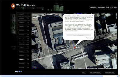
Beautiful exercise in story telling using the web as a medium, from Google map to Twitter, blog and web forms so far. Penguin is embracing the web and its audience in some web crafted narratives. Google group effort but not enough 'Send to a friend' mechanic that could expand the audience. http://www.wetellstories.co.uk/

aglassandahalffullproductions.com


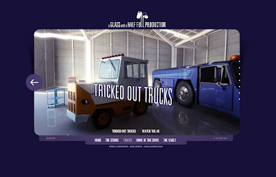
Sometime to shine you have to do something unexpected and Catbury did just that with their monkey ads, sadly it seems they can't do it again with their new truck ads. So the website is designed as a portal to both campaign and you can see how it can be extended for future ones. As much as the site deliver on quality there is no real unity in all the content, at least it's entertaining. The password to the vault is WELCOME but the rewards are poor. The truck competition is worth a look and they should be praised for highlighting the parody on your tube but they could have done more Easter eggs and given more content away for the people to play with. http://www.aglassandahalffullproductions.com/
1 Apr 2008

photoshop.com/express


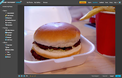
Does Flick or Picasa be worried? Borrowing from the classic itune and Piclens design, Adobe deliver a great user experience and simple tools to edit your photos. The fact that you can hook up to your Flick, Photobucket or Facebook account is a great move to convert people. If they ever do an offline tools or a CS3 integration than this could be really interesting indeed. 2GB only so far. http://www.photoshop.com/express/
Related Posts Plugin for WordPress, Blogger...
 

Copyright © 2011 It's only Digital. All Rights reserved
RSS Feed. This blog is proudly powered by Blogger. Design by dzignine based on Minima-White code frameworks