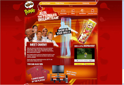
 How many 'show us your skills' competition have been around? To be honest if you have entered one you might as well recycled your video for this one. The site is build for 800x600 and it shows but it's in line with the Pringles site. The 'Special tricks' page is a simple idea that reward you for little off-line effort and the behind the scene is always interesting to watch even if it prove how much time and money has been spend on a shit commercial for a brand that got nothing to do with Football to start with, but hey this is not the place to judge this. http://www.pringles.co.uk/football/ alternatively youTube is doing this http://www.youtube.com/23days
30 May 2008
pringles.co.uk/football/
 How many 'show us your skills' competition have been around? To be honest if you have entered one you might as well recycled your video for this one. The site is build for 800x600 and it shows but it's in line with the Pringles site. The 'Special tricks' page is a simple idea that reward you for little off-line effort and the behind the scene is always interesting to watch even if it prove how much time and money has been spend on a shit commercial for a brand that got nothing to do with Football to start with, but hey this is not the place to judge this. http://www.pringles.co.uk/football/ alternatively youTube is doing this http://www.youtube.com/23days
sexandthecitymovie.com/macbook/
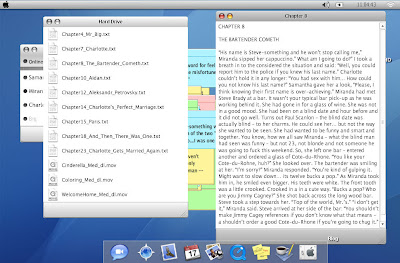 Asking for someone email address from the word go is risky and is not needed. The site is fun and the tasks easy enough for you to complete and discover fun facts from the movie. As an extra / viral site it does everything you expect the only thing that let it down is the blog. So much more could have been done with it. http://www.sexandthecitymovie.com/macbook/
newkuga.co.uk
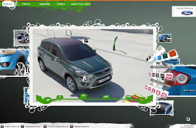 Lovely site that give you the impression you are in control or the environment even if your choice really are limited and your customised car does not follow the other pre-rendered animation. But the site fit with the commercial perfectly. A few more descriptive text could have helped sell the car's USP. Classic mistakes like calling videos: Videos 1, Videos 2, Videos 3...
The 'Leave your Mark' section is actually really impressive, it's a shame that they did no push it to the possibility of seeing the exterior version instead of just showing the options selected. http://www.newkuga.co.uk/
29 May 2008
www.abc.net.au/tv/gruentransfer/
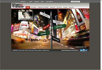 A program worth watching about the advertising world and the site is full of interesting, even if simple, contents for the masses. It's interesting to read consumers opinions on adverts but the prize for creating a fake one should be to actually have you advert show during a real ad-break and not just on the show. http://www.abc.net.au/tv/gruentransfer/
webbyawards.com
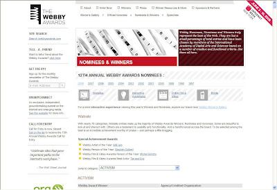 A lazy post...just click and have a look at some of the best digital work around... http://www.webbyawards.com/webbys/current.php?season=12
swoty.com
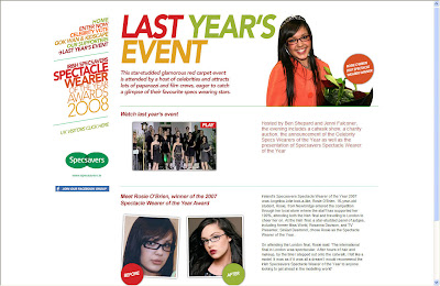 A simple site for a simple campaign, after all they don't need more than this but it would have been nice to see the entries and I would have put forward the video of last year events. MMS entries could have been introduce to gather mobile data. http://www.swoty.com/
28 May 2008
www.channelbee.com
 Can this be a contender for the BBC iplayer or the Kangaroo project? This remind me of the defunct Live TV channel when satellite TV exploded. Looks like a mix between Nuts TV and some late night Channel 4 programs. Well at least they are back-up by HP so they can spend some money before it all goes tits up. http://www.channelbee.com/ and of course http://www.3minutes2launch.com/
tatuagemdaboa.com.br
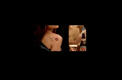 Pepsi did a similar and more personalised version of this idea a while back. The design could have been improved and perhaps a bit more info on the beer would be good too. This sort of campaign always work but the novelty is wearing off slowly. http://www.tatuagemdaboa.com.br/
bombaysapphire.com
by
Unknown
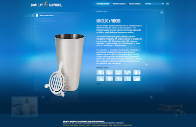 Simple design but the navigation seems to slip under your mouse so perhaps they trying to fit too much on the screen. The site is content heavy but they could have got read of the how-to videos as I therefore expected videos in other part of the site, the interviews for once. They are using the 'Share' function so much it's actually annoying as most of the time the information is not worth sharing, one icon at the bottom of the screen would have done the trick. http://www.bombaysapphire.com/
27 May 2008
uplay.ubi.com
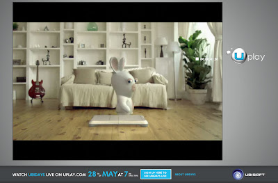 It's only videos but I like...actually it's all based around the off-line event but they managed to get the teasers coming and the quality of the content is balanced to gather for hard-core and regular gamers. Simple and effective but they could have create RSS feeds for alerts of new content and the registration could be a bit more targeted to the user needs...http://uplay.ubi.com/
diamondshreddies.ca
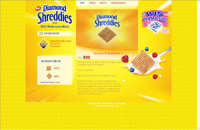 A few years back Coke did a similar thing when Coke Zero launched. It's the sort of simple campaign that is clever, cheap to produce and stick in your mind. Perfect for viral and discussion. They could have taken the risk of creating a Facebook page for each shape but this could always back fire if no one subscribe, they played it safe and I think it's the right decision. http://www.diamondshreddies.ca/
22 May 2008
tacobell.com/valuemenu/
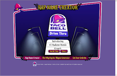 You can actually upload up to 4 pictures of your friend if you feel like sharing. This is the plus point as the site is really a poor excuse to display a flyer with the new burger prices. http://www.tacobell.com/valuemenu/
21 May 2008
satinelle-ice.philips.com/global/
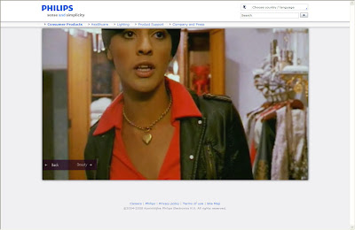 In such a PC world it' s nice to see a company that is not scare to demonstrate that everyone use their products and I hope Philips is doing more than just going after the 'Pink dollar'. The site had to fit withing a main template but they are rightly using the most available space for the videos. The strength here is not the design or the navigation it's James' story. http://www.satinelle-ice.philips.com/global/
20 May 2008
liptoncleargreen.nl
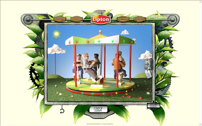 Beautifully crafted animations that help the message but will only work once. I don't think this is an issue as the site seems to be based on brand awareness but a downloadable coupon or sample request could have been negociated. Perhaps a daily quote widget could have added fun. http://www.liptoncleargreen.nl/
19 May 2008
kampanj.siemens-hushall.com/showroom/
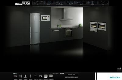 The design is slick but the selection tool isn't. You can select with various criteria but I do not find it engaging considering that you can swap appliance later on in the main stage. I would have put more importance on the photography. Good use of sound but the loop is annoying. http://kampanj.siemens-hushall.com/showroom/
16 May 2008
diesel.com/cult/wall/
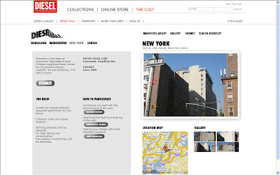 Getting involved with a brand from a creative point of view is always a good think for the brand and for the consumer. Diesel makes a bold move by letting people express themselves, it goes with the spirit of the brand and it works. They could have shown a video of the design been made, of the winner reaction or resident instead of slideshow. The same goes with the other locations, they could have given more info about the neighbourhood instead of 4 lines of generic text and perhaps the winner could have actually be picked by the people that live in these location. http://www.diesel.com/cult/wall/
cathaypacific.aero/index_en.html
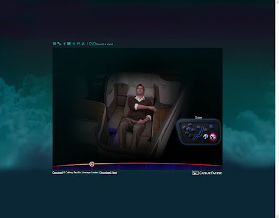 There is no doubt that the virtual tour is impressive but the small size and the jagged streaming let it down, the quality of the images doesn't reflect the high standard of the plane. The same goes with the seat tour, great use of video but the design let it down and if you are going to use real footage of people, make sure they talk because it's pointless to see people moving their lips without sound coming out. As for the flight simulator well, what's the point? To get you exited about the competition, sorry I wasn't http://www.cathaypacific.aero/index_en.html
sofabash.com
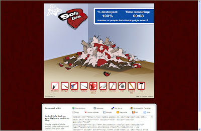 The game is terrible, poorly designed, poorly executed and isn't a challenge, you might as well just do a site where people redeem their free voucher without going through this. And if they think people are going to embed this on their page, well they can go for a jog... http://www.sofabash.com/
biclegends.com
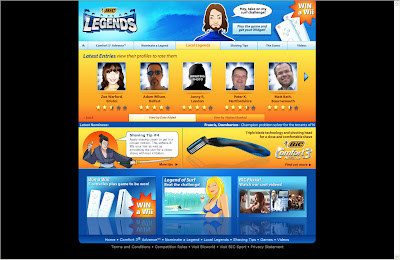 I am sure it's hard to push a razor blade on the net but I saw better than this. The site try everything from pushing you to nominate a friend to a game that has nothing to do with the product to some videos that we are supposed to found so funny we have to forward them to the usual free entry draw. Shame on you... http://www.biclegends.com/
15 May 2008
bragster.com
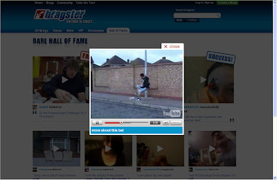 Jackass meets paddypower, it's fun and the content is perfect for viral and any videos site so they should get the traffic. There is some nice community idea in here like the bubble that show you what people are doing on the site and the design is clean and encourage feedback and interaction but of how long people will be interested in this? especially as you only win £100? http://www.bragster.com/
tate2tate.co.uk
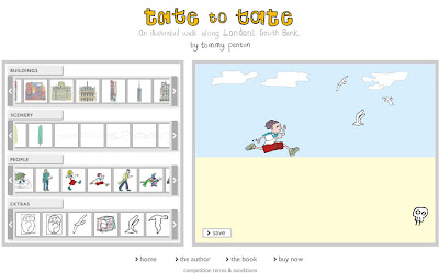 A nice concept for a competition based on this London book sadly the site is too small to appreciate the drawings and there is to many option available to create the scenery. You can deleted the scenery in place, this could be a good thing to create your customise wallpaper but not great for the competition. A drag and drop technique should have been better. They are using Flickr to save the picture, this should be praised but I am not sure their audience is ready to go to this lenght to enter the competition. http://www.tate2tate.co.uk/
14 May 2008
wendyswereld.nl
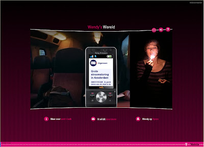 I haven't got a clue about what's going on but you can still give it a go in this interactive story, it's only trial and error. Good use of videos but nothing unusual I am afraid, at least you can be her friend if you want. http://www.wendyswereld.nl/
13 May 2008
softbank.co.jp/helloworld/
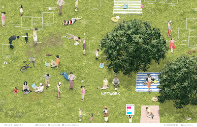 Ok it's only a portal, a big fat lovelly videos portal but I don't care I am just clapping my hands in tune with the music. Of course some easter eggs would have been lovelly and a few downloads could have been nice too (paper cut out of the people and A4 picture of the grass would have amused me for hours) http://www.softbank.co.jp/helloworld/
pepsimax.no/campaigns/maxfan/
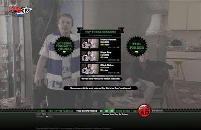 Pepsi gets it right, ok a bit of stereotype in there but it will connect with the people that use to watch Baddiel and Skinner. The full size video adds to the TV feel, the tips add some great opportunity for fun downloads (try the MMS saviour), the send to a friend is actually useful (Match Planner), the Pizza partners make it relevant and the competition managed to get a twist on the old classic 'shout to win' brilliant! http://www.pepsimax.no/campaigns/maxfan/
12 May 2008
stepintothenhs.nhs.uk
by
Unknown
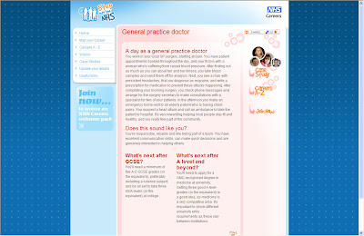 Get them when they are young seems to be the goal of this site but after doing the quiz my choice where Medical laboratory assistant or Gardener, is there something wrong there? The videos do look like they have been created for Blue Peter but there is in fact a lot of information for the kids and you can even get a welcome pack send to you. The design could have been better but it's a nice try for the NHS. http://www.stepintothenhs.nhs.uk/
9 May 2008
marsballsgetbritainplaying.com
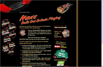 Not only the design is horrible, the navigation is confusing, I managed to get a run time error and the site relies on to many poor content placed on partners' site, the Sun's 'badge creator' is terrible. This look like the classic case of we got our PR, partnership and offline sorted and we should do something online but we only got peanuts in our budget for it. http://www.marsballsgetbritainplaying.com/
cocacola.com.br/futebol/
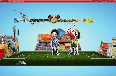 There is no need to have a 3D environment for the game but it's fun, of course, it would have been better to be able to fight a a friend online. The actually offline promotion is what's count so I would I like to see some feedback of the campaign to see who is winning the public. http://www.cocacola.com.br/futebol/
journeys.louisvuitton.com
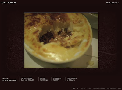 It does make for some interesting videos, especially the Keith Richard ones but what does it tell you about the brand? Well if you have the money you can get whoever you want to work for you. The site does fit perfectly with the offline poster and each sections does have a different feel that take you in. Beautifully shot, edited and photographed you these are beautifully journeys indeed and the behind the scenes footages are worth a look too. http://journeys.louisvuitton.com/
gnarlsbarkley.com
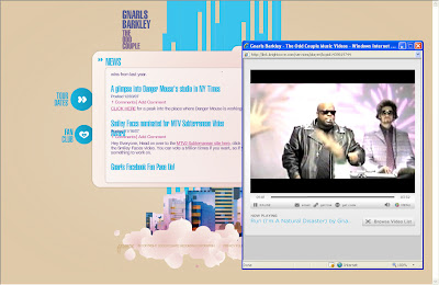 I like the design of the site but there is a few text error (going over lines) and there is no need for pop-up to showcase videos. The problem is that with such iconic people and considering that they were the first one to do have a digital download number one there is no enough digital elements to the site. No widgets, no downloads to your phone, no Easter eggs, no behind the scene footage, no "dress your own barkley" game and ultimately no interaction. I want more for a group like them. http://www.gnarlsbarkley.com/
cantori.it
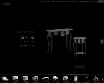 The navigation is confusing, start at the bottom, select in the middle and browse at the top but it does work better in full screen. The design is stylish (even if a bit to dark for a bright office monitor) and showcase the furniture nicely. The music does had to the atmosphere. http://www.cantori.it/
nokia.co.uk/evolve
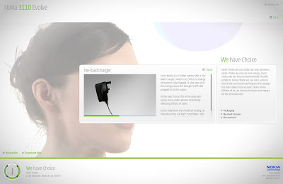 A simple well design site that let the message speaks, the videos are short enough for you to stay tune and prove the credibility of the campaign, but where is the subtitles option?. The site showcases the phone in its simple form and doesn't push for you to buy it (you might even miss the 'buy online' link). My only issue is that they could have done without some scrollbar for the text and don't seem to be an accessibility version. I hope the videos are uploaded to the phone too by default as it would be a shame not too. http://www.nokia.co.uk/evolve
8 May 2008
darkorpure.co.uk
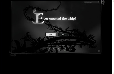 I really hope that this will get better because after completing the test and having to enter my fake details the only thing I got was one personality line that could come out of any girl mag, Why do they think I would send this to a friend? If only I could at least have my profile as a widget or download the lovely imagery as wallpapers. Ghdair tries to be the Agent Provocateur of the air industry, great, but this hasn't let me wanted more. http://www.darkorpure.co.uk
instantaction.com
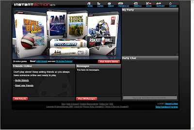 I am always in favor of a brand sponsoring a game, a widget or even a site than creating something inferior, unpopular and that is not going to be used as the 100's of Facebook applications lying dying prove. So if you are going to do a web game that has community and interactive elements why not try these guys or even why not invest in some proper game developers for your agency? Don't forget to check out http://www.garagegames.com/ from the same people as you could technically develop games for Xbox too. Gaming platforms are still untouched by brands, Burger King did had a go but to break this market you need to be clever than that and deliver quality, not your usual shit flash game. http://www.instantaction.com/
www.warnermtm.co.uk
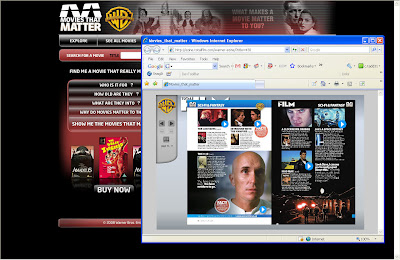 I like the fact that the search is on the front page but the results are disappointing, got 'Cool Hand Luke' as part of a 'rom coms' search. The movies page could do with a better classification, perhaps using tags would help. The Ezine is a good idea that is lost in it's present form and you should be able to register to it to get the next edition, but the association with Total Film actually give it credit. As for the widget it actually shows that you don't need the site at all. http://www.warnermtm.co.uk/
itv-creative.com/live-like-a-star/
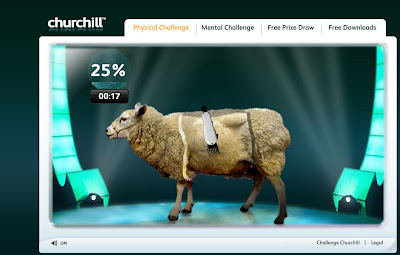 Churchill is sponsoring 'Beat the Star' so what do you get for this? A free prize draw and some games vaguely relate to the program. Is the issue here that really the sponsorship is wrong to start with? I know it follows the 'Challenge Churchill' campaign but more could have been done to connect both brands and generate quotes request. http://www.itv-creative.com/live-like-a-star/
bbc.co.uk/radio1/bigweekend/
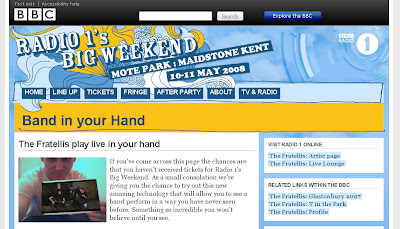 I can't wait to see this use for marketing purpose...Lynx: All the girls in your hands? of course the take up rate will be low, of course the Eye Toy for PS2 could do something similar but at least the BBC is using my money in a way I want it to use it. http://www.bbc.co.uk/radio1/bigweekend/2008/feature/bandinyourhand.shtml
7 May 2008
naturellementpulpeuse.fr/venividibloggi
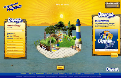 Lovely site and a fun idea but what is the point really? at the end of the day it's just a prize draw and the mini games are not originals. You might play with the brand but I don't buy that it will actually make you love it. Interesting are the op-in options; alert when you got up a rank or when new items are available, they are actually worth op-in for. But why are they mixing it with some snow tour that will be finished in 2 weeks is beyond me, hopefully they will removed it soon.
http://www.naturellementpulpeuse.fr/venividibloggi
specsavers.co.uk
by
Unknown
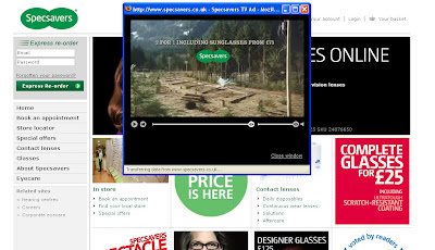
Saw the TV ads, a bit of David Lynch in there, and was exited because it was a bold move from specsavers not to feature their products but instead push people to go to their site to found out what happen next. Would it be a well crafted site about what is happening to the town, a campaign that will reveal itself slowly during the coming month? or perhaps a video feast site with interview of the town people (wearing glasses of course) ? maybe a small ARG? what could it be? and it was a fucking let down, instead you get to watch the full advert in a small pop-up and the climax is not even funny...waste of time, they should have use iTV instead, at least I would have not have been as disappointed. Shame on you, http://www.specsavers.co.uk/ and if you want a viral for glasses then try this one.
6 May 2008
mentoskisscam.com
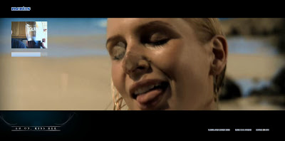 What is not to like? video and a clever use of your web cam but they could have take it further: when using the send to a friend, your friend should be redirected to the video footage of your own kiss or Mentos should at least store the videos and use them once the campaign is finish on a 'Mentos' Kissers' hall of fame. The kiss part of the video should be downloadable as a screen saver or mobile video so it can replace the annoying dog that everyone seems to have. No 'add this' option, no coupon for a free Mentos and not even a 'who should be our next Mentos kisser?' survey. I would have like to see more kissers too form other ethnic origins or other sexual preferences (hey we are living an PC world you know) http://www.mentoskisscam.com/
2 May 2008
weetabix.co.uk/schoolsports/
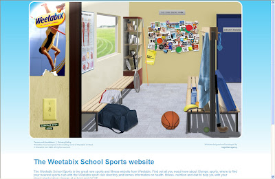 Heath is still part of a lot of marketing campaign and this site do the same as most other sites, basic information that are available on the net allready. Why trying to do a funky design for kids, when kids will not visit the site? They don't care about the 'local sport club search' or about any of the Olympics events (if they do they will already be part of a club!) or about the benefit of a good diet or about the key stage guide. This site is for the mum and the dad so make sure the design reflect this. Do not include a pdf quiz, if you haven't got the money to do an online quiz just don't try to found a cheap and shit solution, just use the money for something else. http://www.weetabix.co.uk/schoolsports/
friendreunited.com
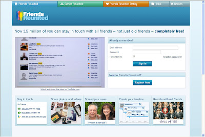 What do you do do fight back against Facebook 8 millions subscribers? you make you site free, give it a new design and borrows some functionalities from the best community sites around. Will that be enough to get people back? it might just do it...http://www.friendreunited.com/
areyoubritishinbed.co.uk
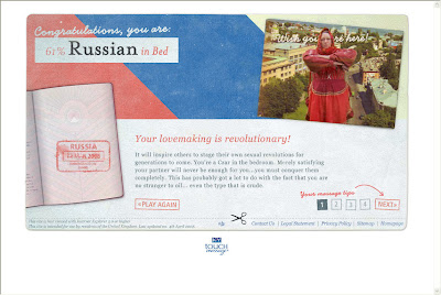 Sex sells and it's a shame that this campaign is base on this to support the product. Of course a good massage can lead to great sex and KY is better know for its jelly but they could have try to be more romantic on this one. It's nice and there is a little Facebook widget and a ringtone too but it doesn't brake any mould. http://www.areyoubritishinbed.co.uk/


